Visualizing U.S. Education Data
insert_chart INITIAL INVESTIGATION
BACKGROUND
At the beginning of the project, we thought about our own difficulties in choosing a college. We had to consider available financing, institutional reputation, distance to home, extracurriculars, choice of programs and majors, etc. We wondered whether data, rather than just our parents and guidance counselors, could have made this process easier.INITIAL DESIGN QUESTION
How might we help high school and undergraduate college students make decisions for their post-secondary education?TARGET USERS
High school seniors in the U.S. education systemCOMPETITIVE ANALYSIS
- The College Board
- Chegg
- Khan Academy
- University websites (e.g. admissions.rpi.edu)
DATA SET
We found data sets from the National Center for Education Statistics (NCES), which is a federally funded organization that collects and analyzes data related to education in the United States. We initially decided to use the NCES Study of 1988, a longitudinal study of about 17,000 eighth grade students over the course of more than a decade.INTERVIEWS & PERSONAS
We interviewed 7 students and developed 2 personas based on these individuals.- Dustin - Has difficulty choosing between a major he's interested in, such as journalism, or a major with good job security, such as engineering.
- Rebecca - Wants to find an academic path that would best meet her interest in genetics, philanthropy, and making a positive impact on humanity.
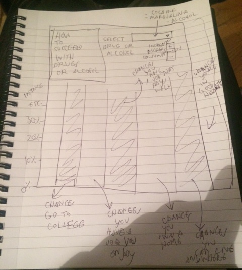
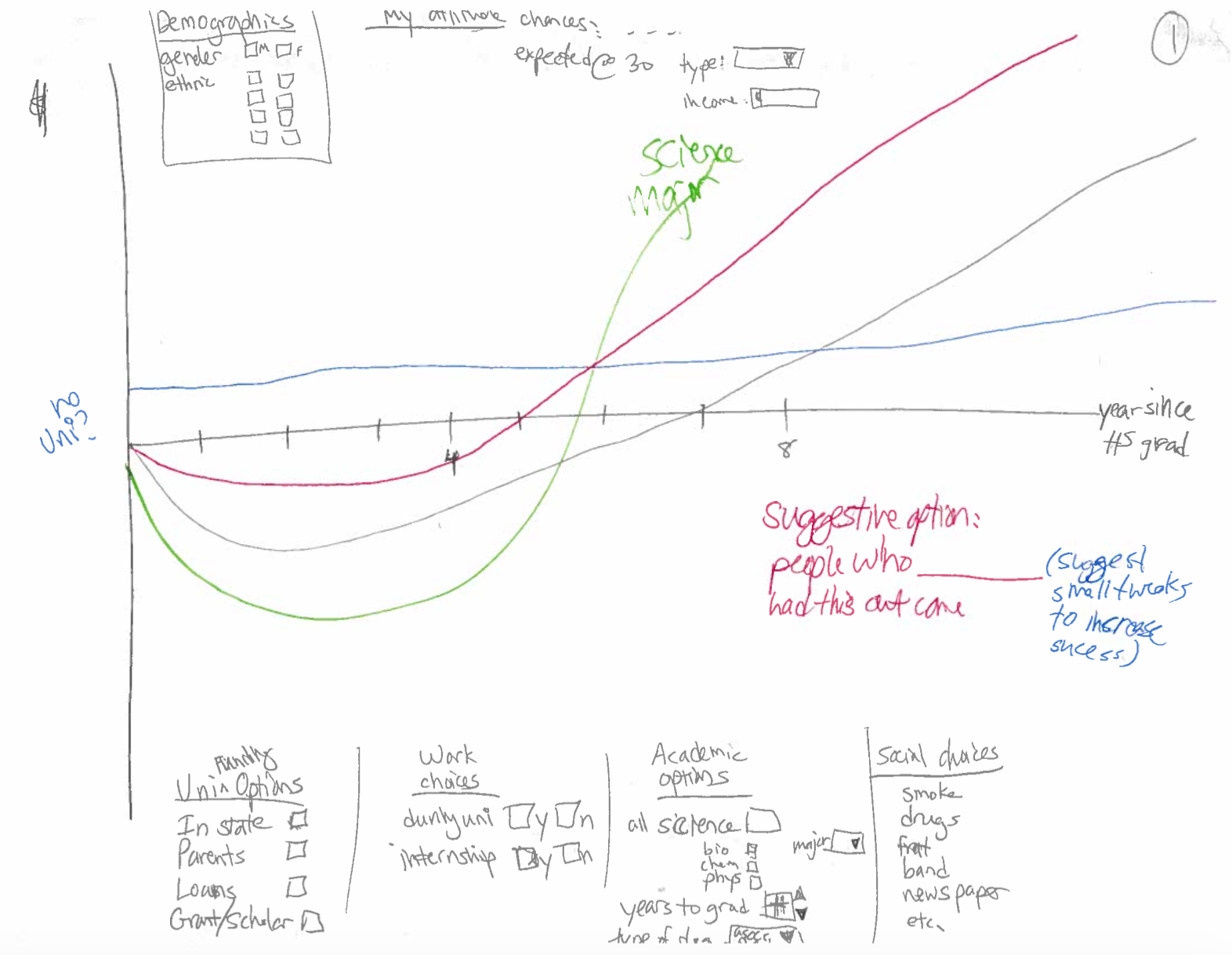
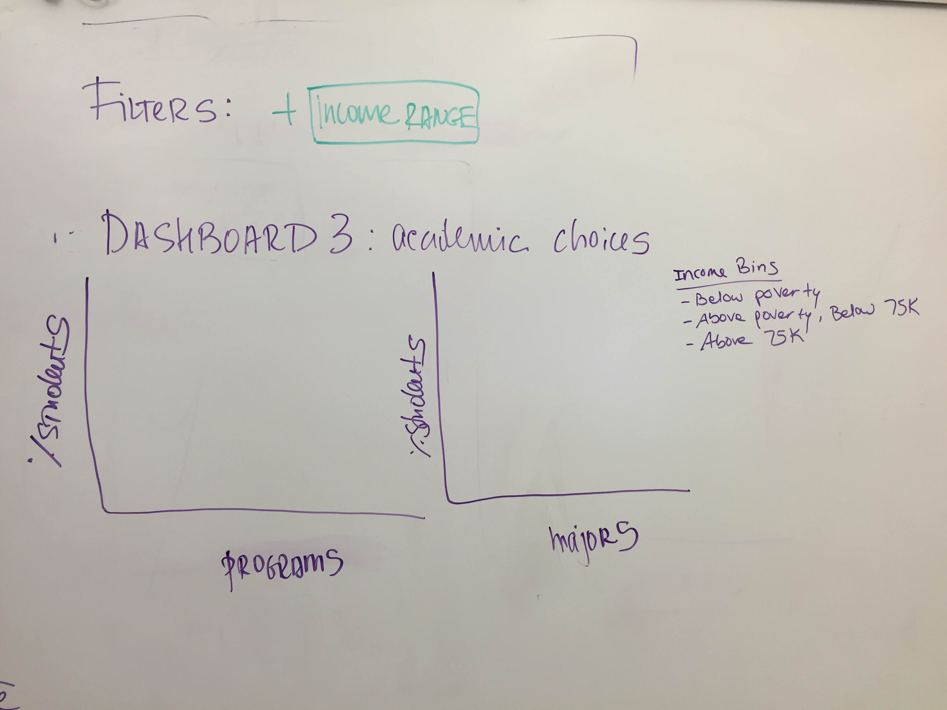
SKETCHES & USER FEEDBACK
insert_chart REDEFINING THE PROBLEM
DESIGN QUESTION
How can data help college admissions counselors more effectively recruit and counsel prospective students?TARGET USERS
College admissions officers recruiting domestically in the United StatesINTERVIEWS & PERSONAS
We interviewed 4 students and developed 3 personas based on these individuals.- Jackie - Wants to recruit more low income and first generation students.
- Cameron - Wants to recruit out of state students.
- Kendra - Wants to recruit international students.
UPDATING THE DATA SET
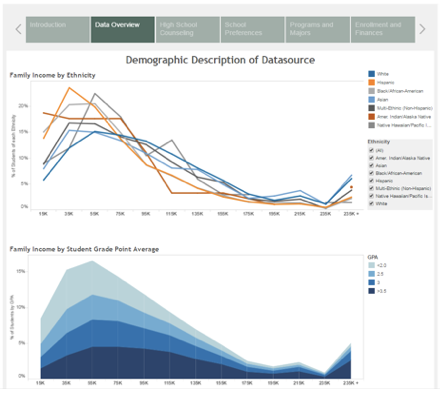
We updated our data set to the more recent one, which contains 23,000 ninth graders from 944 schools starting from 2009. We extracted 30 variables from the study for our graphs.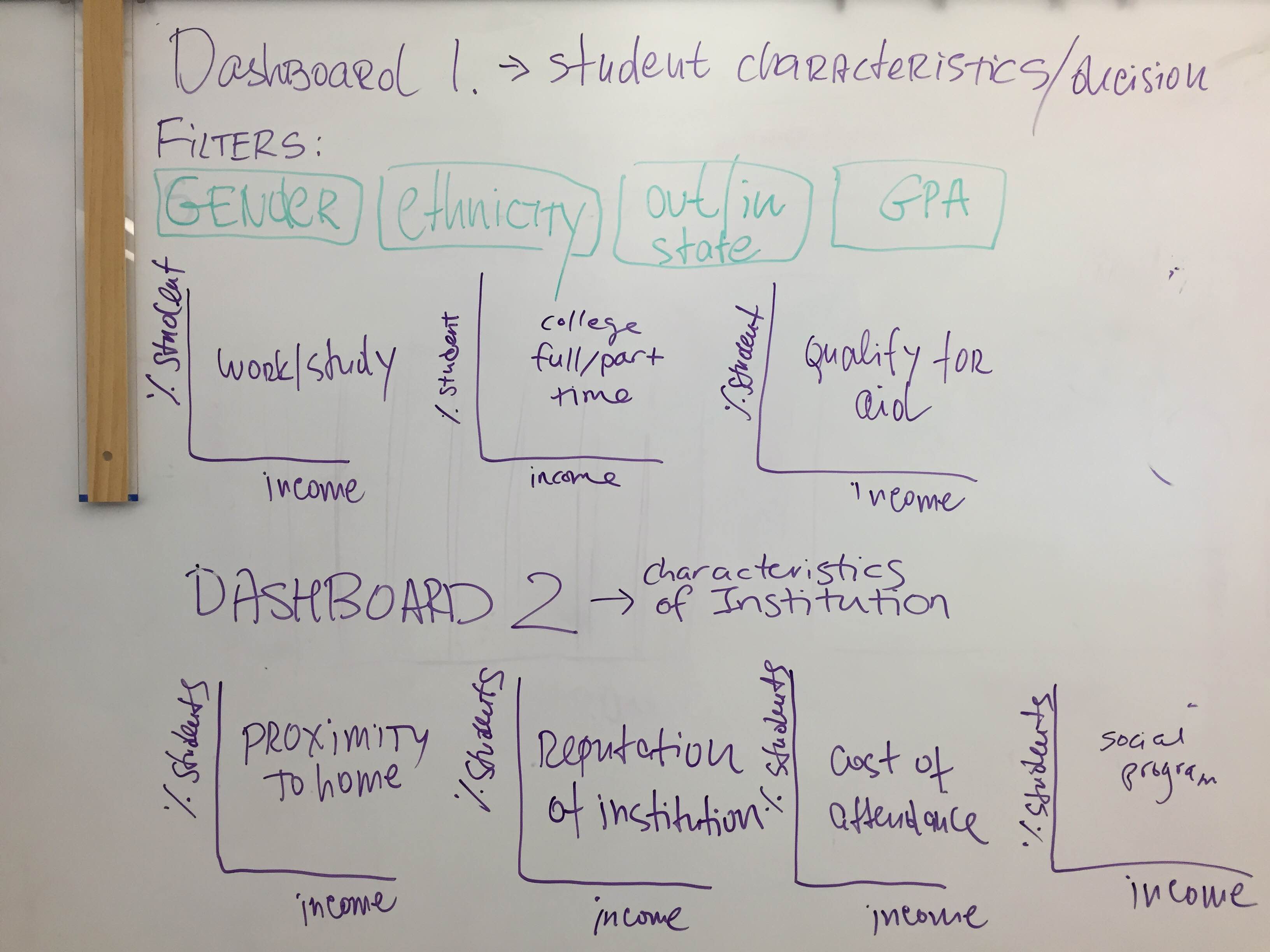
USABILITY TEST
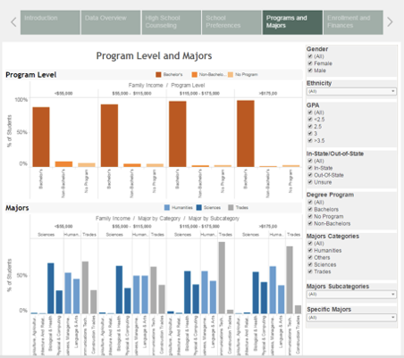
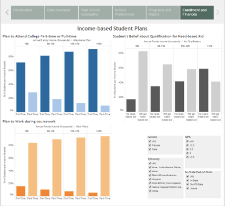
We mocked up our sketches in Tableau, and conducted usability tests with college admissions counselors to identify areas for improvement. We prepared a script, list of tasks, and a brief survey for participants to complete after the test.
As a result from the test, we made improvements on confusing graph axes, titles, and labels. The color scheme also confused users in several graphs, so this was also updated to avoid misrepresenting different data as being alike.
Unfortunately, the biggest piece of feedback was something we were unable to fix, due to resources and time constraint. The content of the data presented was too general for our users. They have other paid tools and resources that would allow them to look up detailed information about students (e.g., standardized test scores, email addresses, etc.). The publicly available NCES data set does not provide personally identifiable data, and we do not have the resources to compete with these other tools.
insert_chart FINAL DESIGN
DELIVERABLES
- Interim project update presentation
- Interactive data visualization tool
- Final project presentation
- Formal paper detailing design process and results
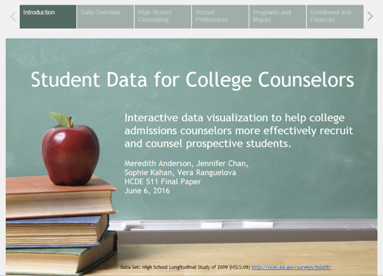
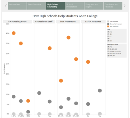
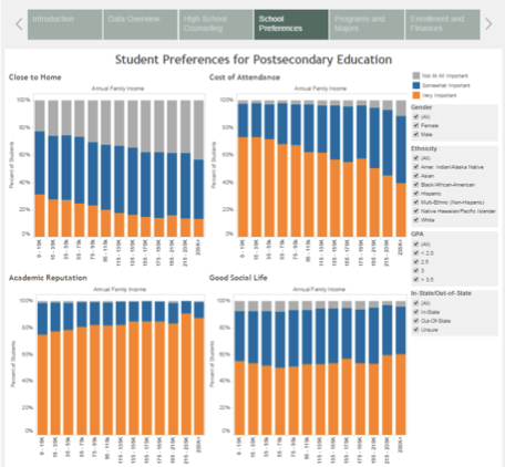
DATA VISUALIZATION TOOL
